Empowering Parents: OOM App Boosts Efficiency by 30%

UI / UX Design

User Research

User interviews

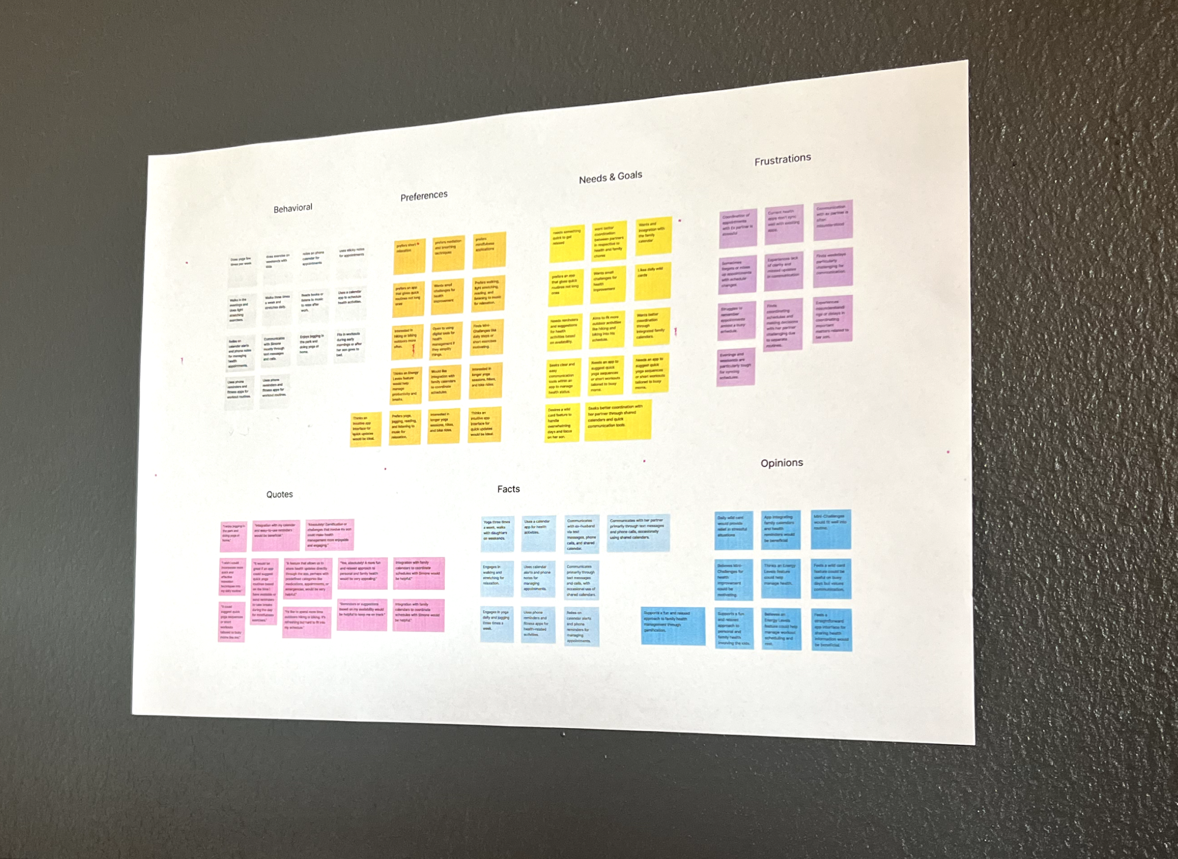
User Research Analysis

Competitor Research

User Personas

User Flows

Wireframes

Mockups

Prototypes

Usability Testing

Accessibility

Design System

Project Roadmap

CUSTOMER

05/24 - 09/24

ROLE: UX DESIGNER

UI / UX Design

User Research

User interviews

User Research Analysis

Competitor Research

User Personas

User Flows

Wireframes

Mockups

Prototypes

Usability Testing

Accessibility

Design System

Project Roadmap

CUSTOMER

Career Foundry arrow link

05/24 - 09/24

ROLE: UX DESIGNER
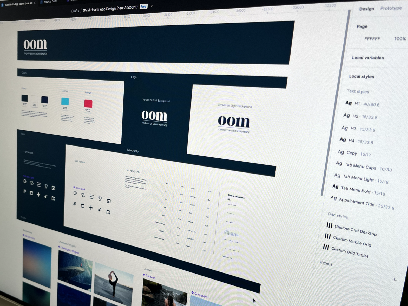
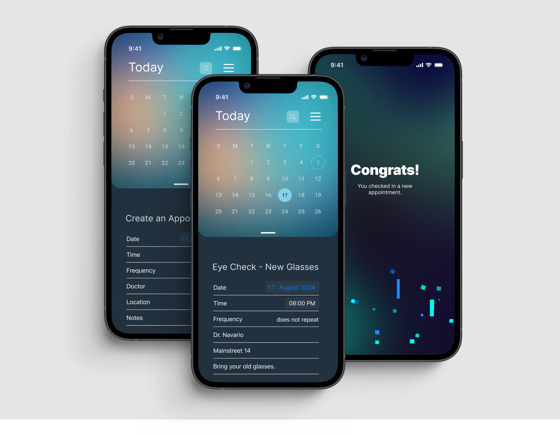
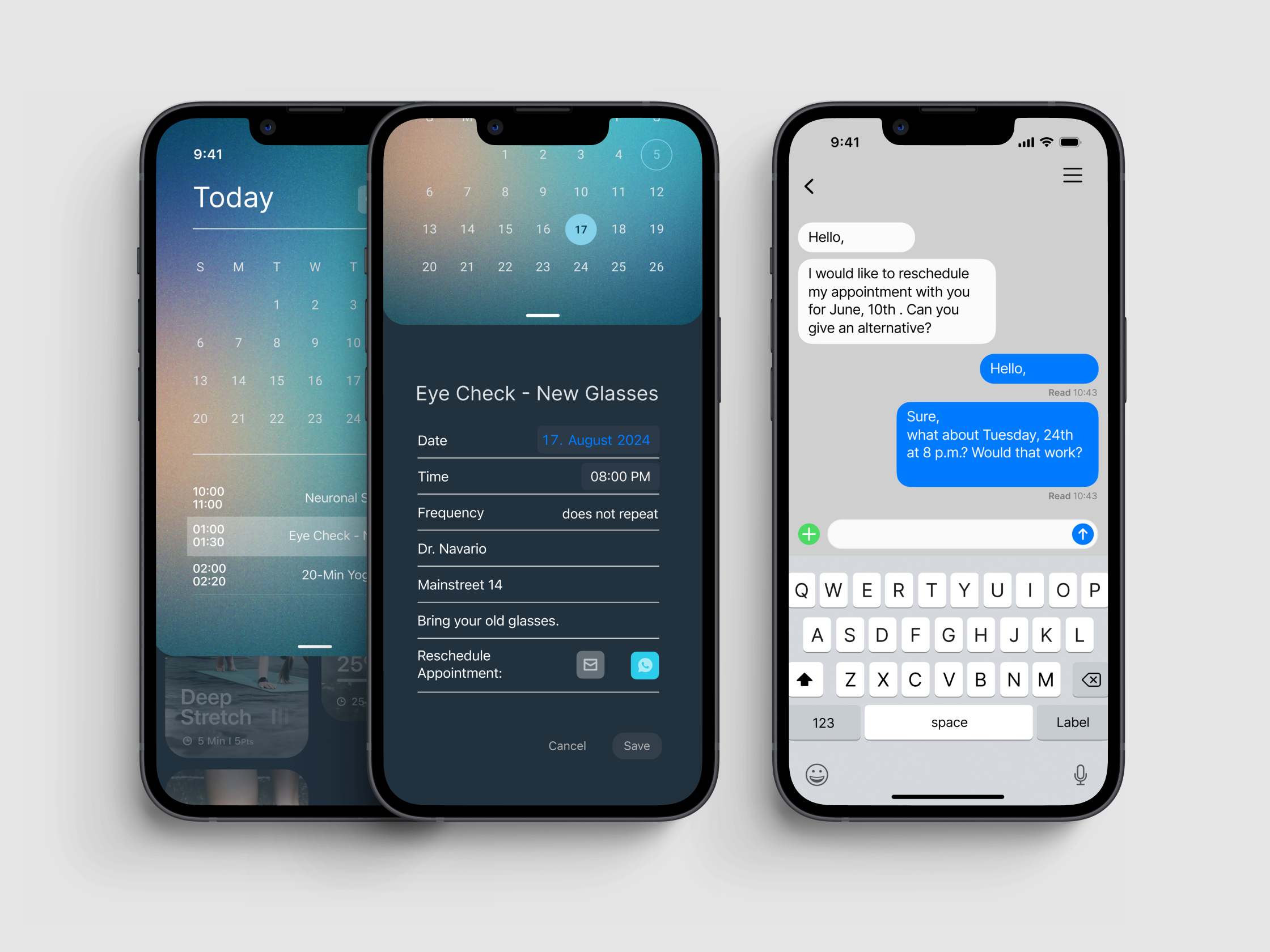
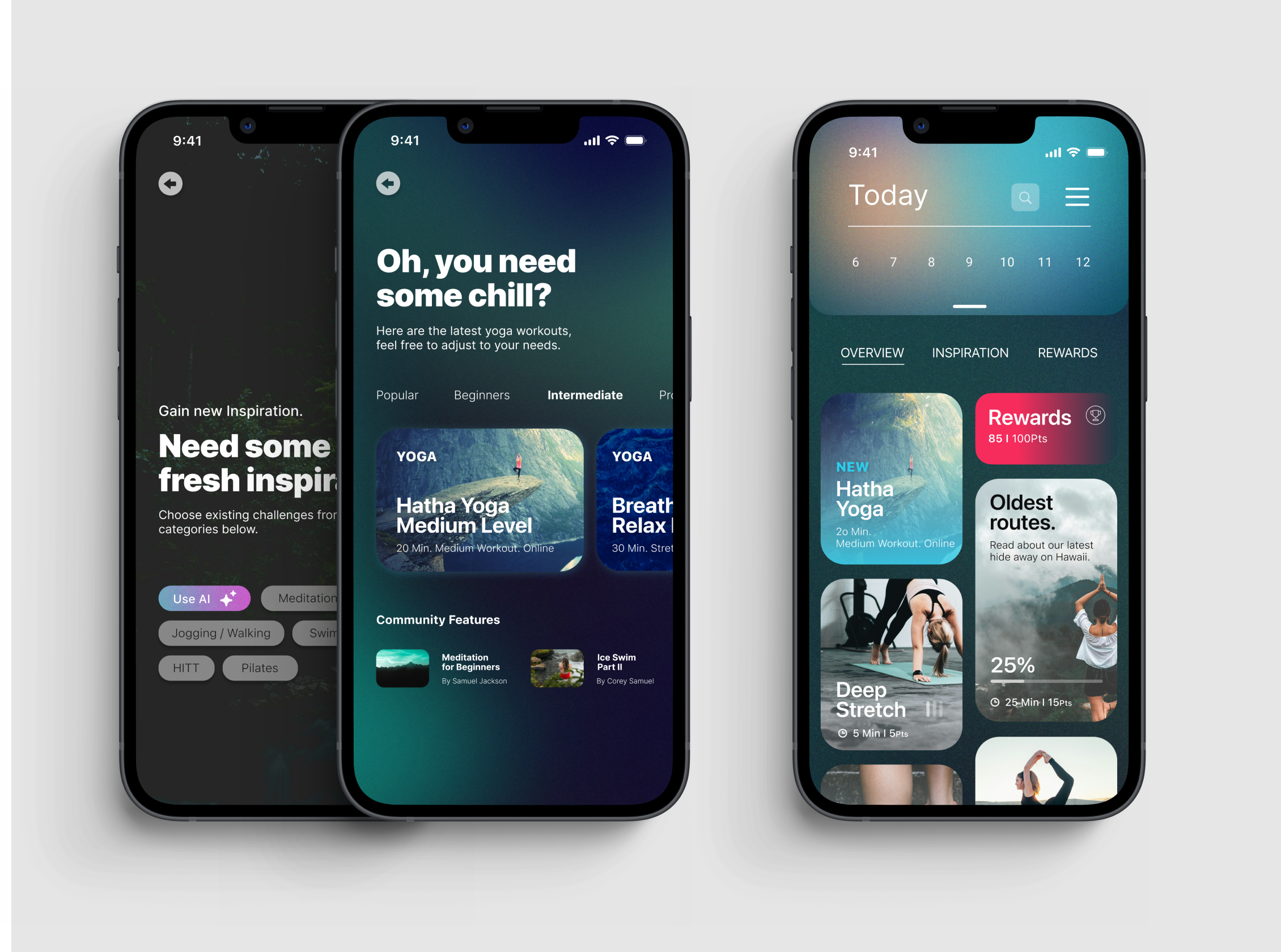
Designed for busy working parents, OOM is all about making life easier by streamlining health and fitness appointments, cutting down scheduling time by a smooth 30%. Along the way, I built a sleek design system to ensure consistency and keep the app running as smoothly as a morning coffee.

Challenge: Designing a Time-Saving Health App for Busy Parents

Challenge: Designing a Time-Saving Health App for Busy Parents

The key challenge was to design an app that empowers busy parents to stay on top of health appointments and make small, manageable steps toward a healthier lifestyle – eliminating the frustration of lengthy to-do lists or fiddling with complex features.

Finding Focus: Designing a User-Friendly MVP

Finding Focus: Designing a User-Friendly MVP

The first step involved gaining an understanding of the market through initial interviews, which made it straightforward to prioritize the MVP features.

I concentrated on the key functions:

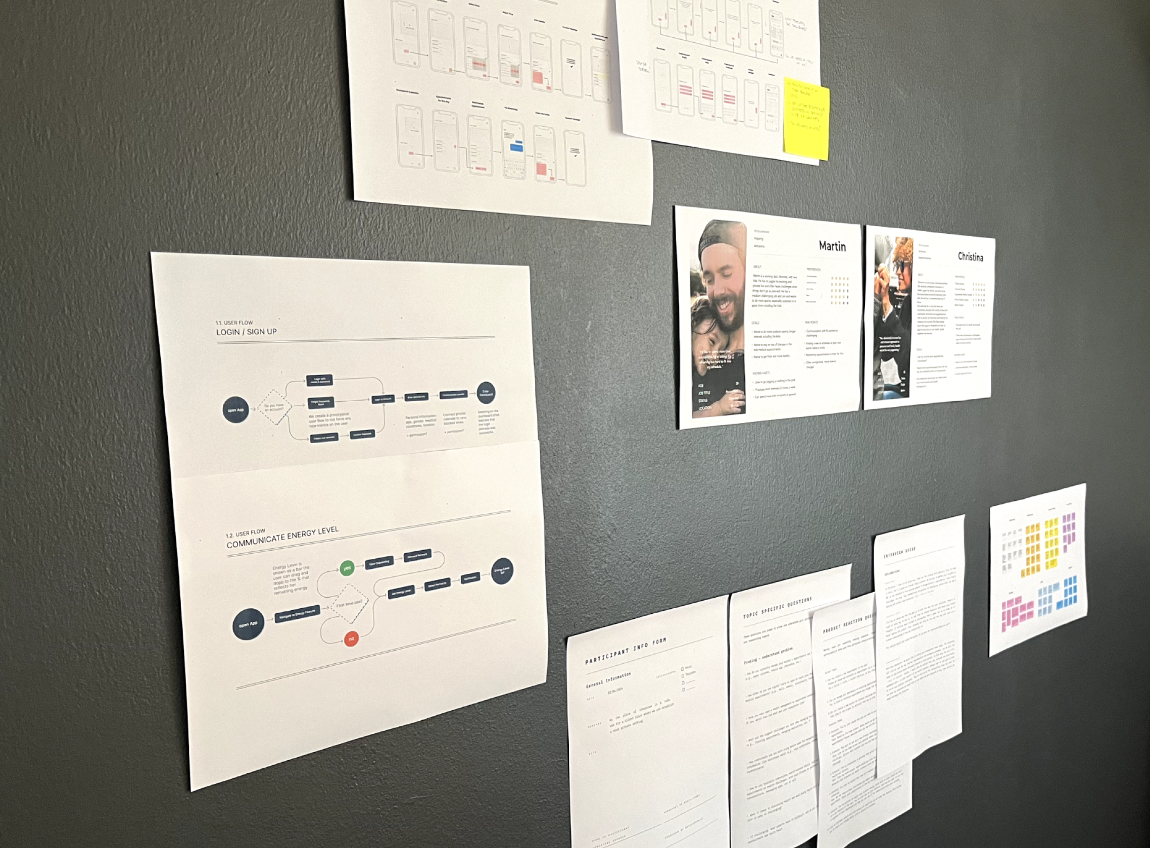
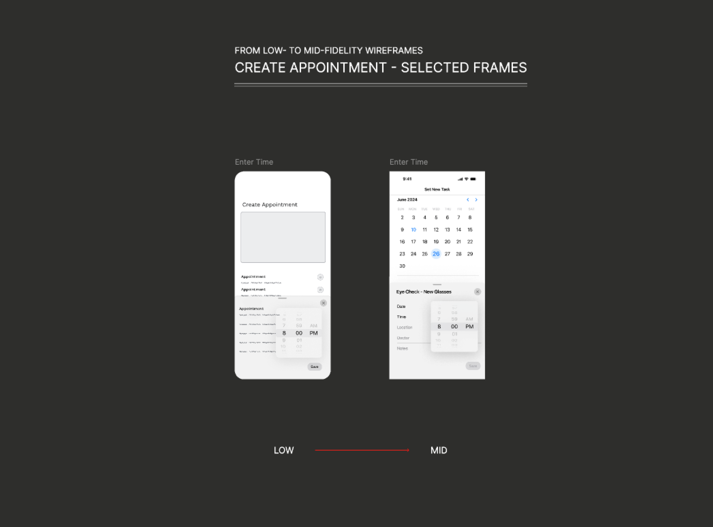
Managing health appointments and scheduling sports challenges. With the scope clearly defined, I worked out some User Flows and Low Fidelity Wireframes.
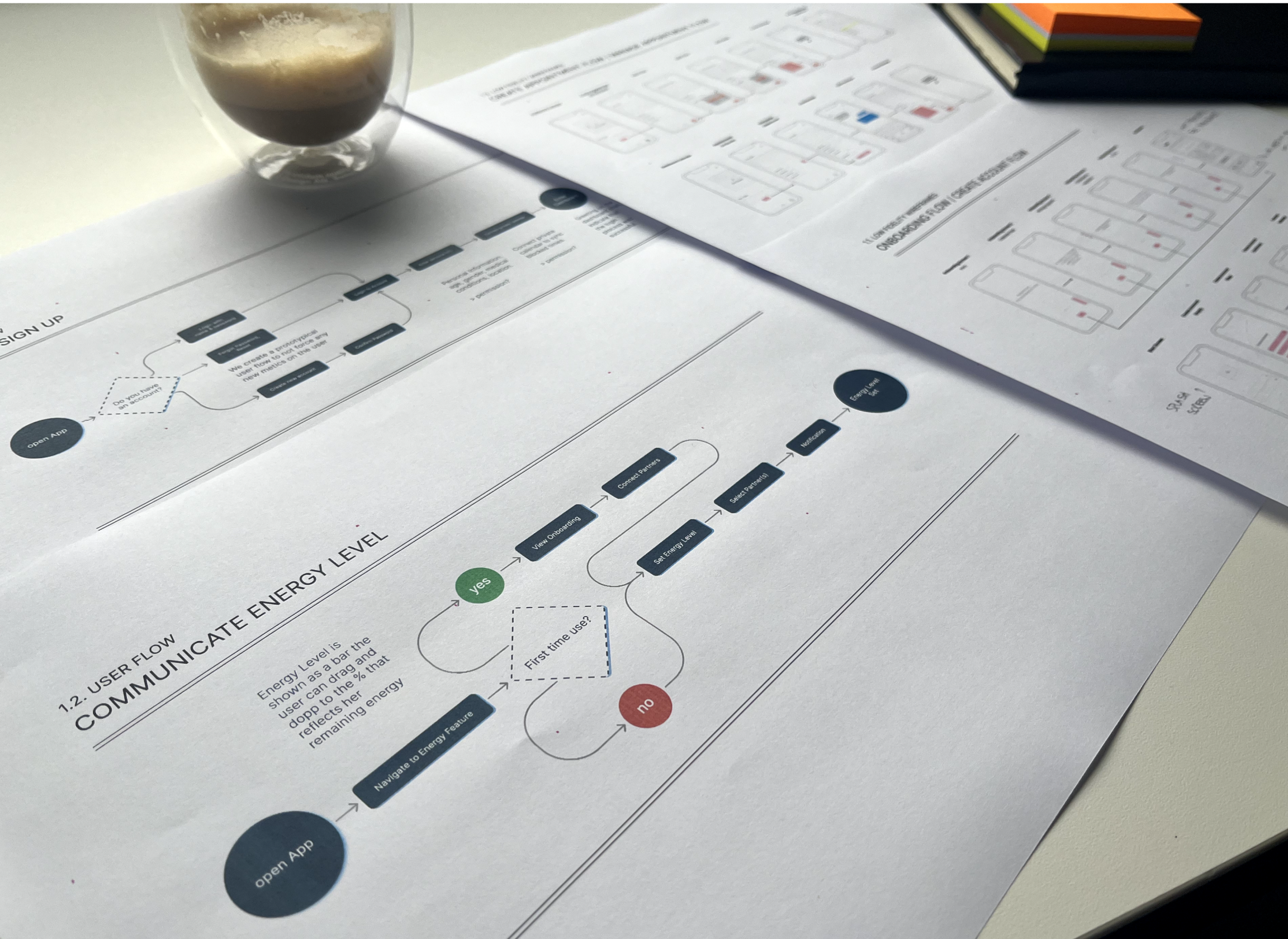
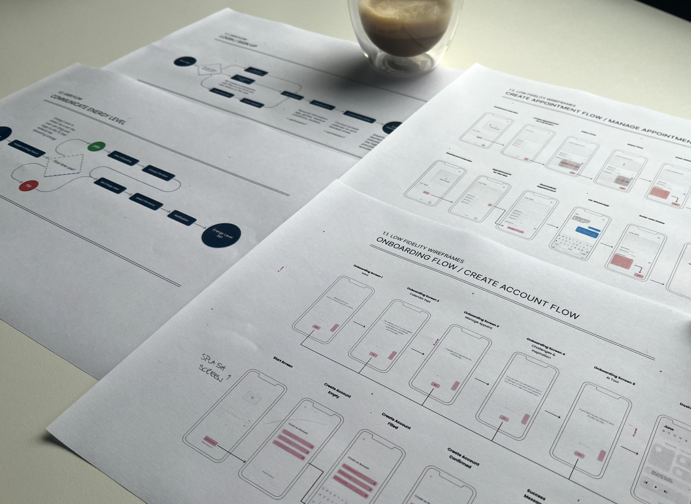
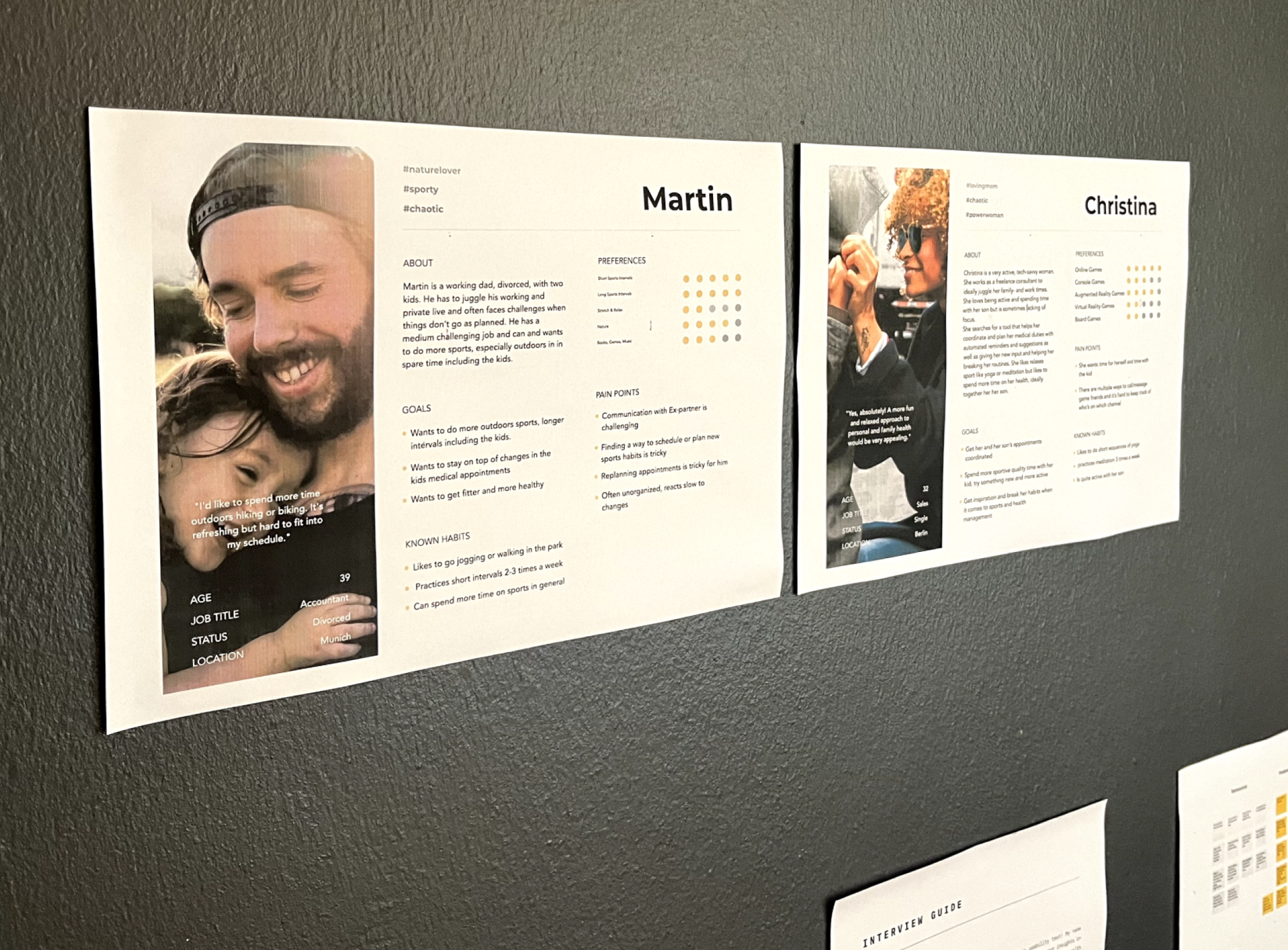
Based on these interviews and initial assumptions, I refined the Personas and Flows for further testing.

User Testing: From Insight to Impact

User Testing: From Insight to Impact
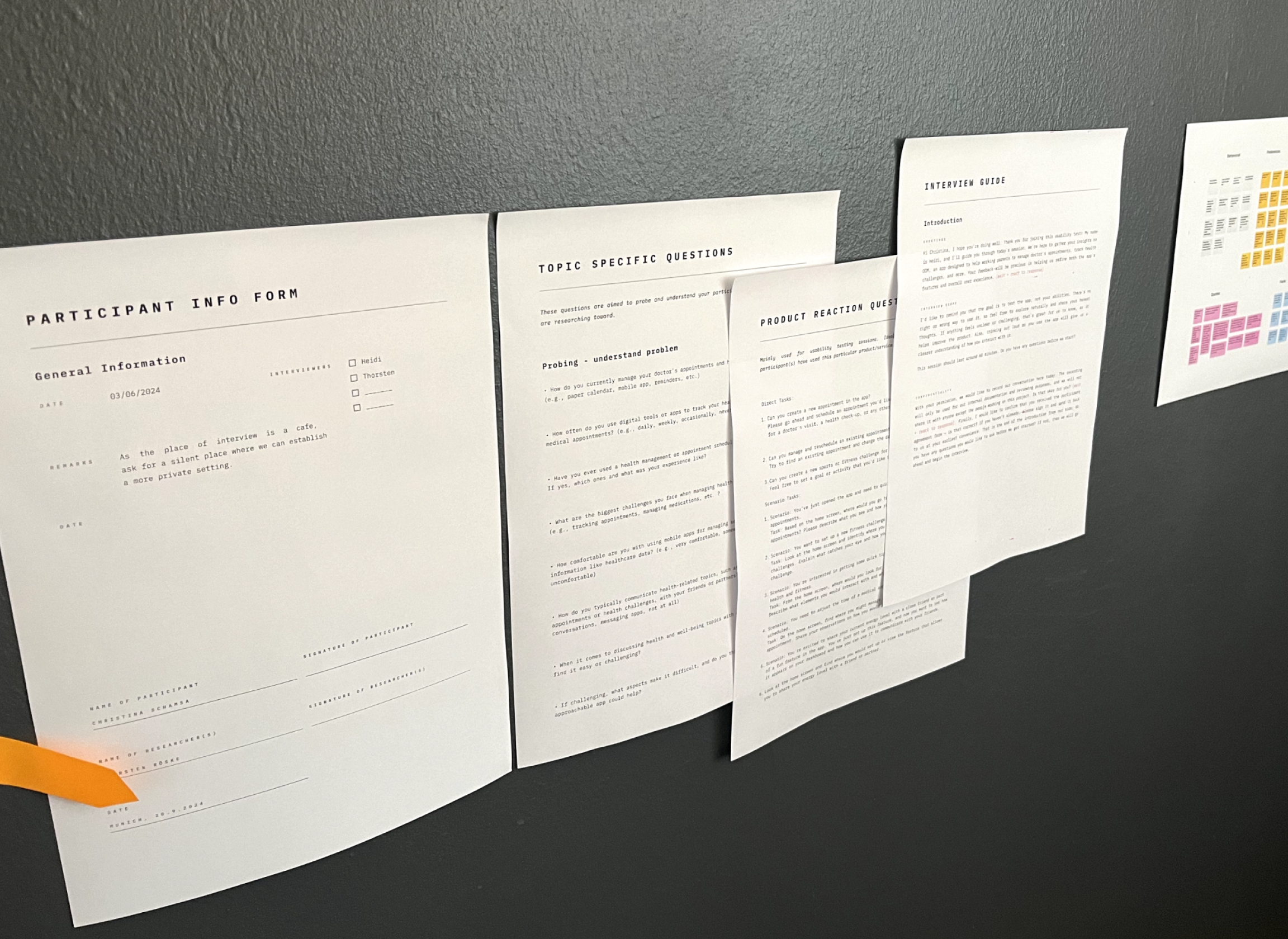
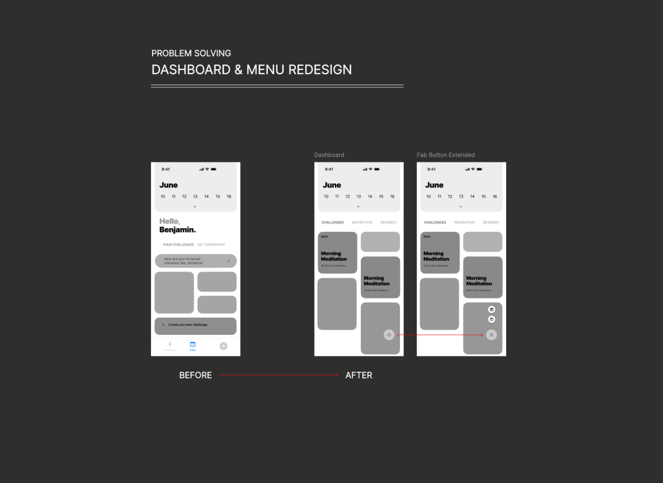
To my surprise, the first round of user testing indicated that 64% of participants struggled to create challenges directly from the dashboard, even though competitor research suggested that this flow was effective. It became clear that despite my thorough groundwork, the reality of user experience told a different story, prompting me to rethink the approach.
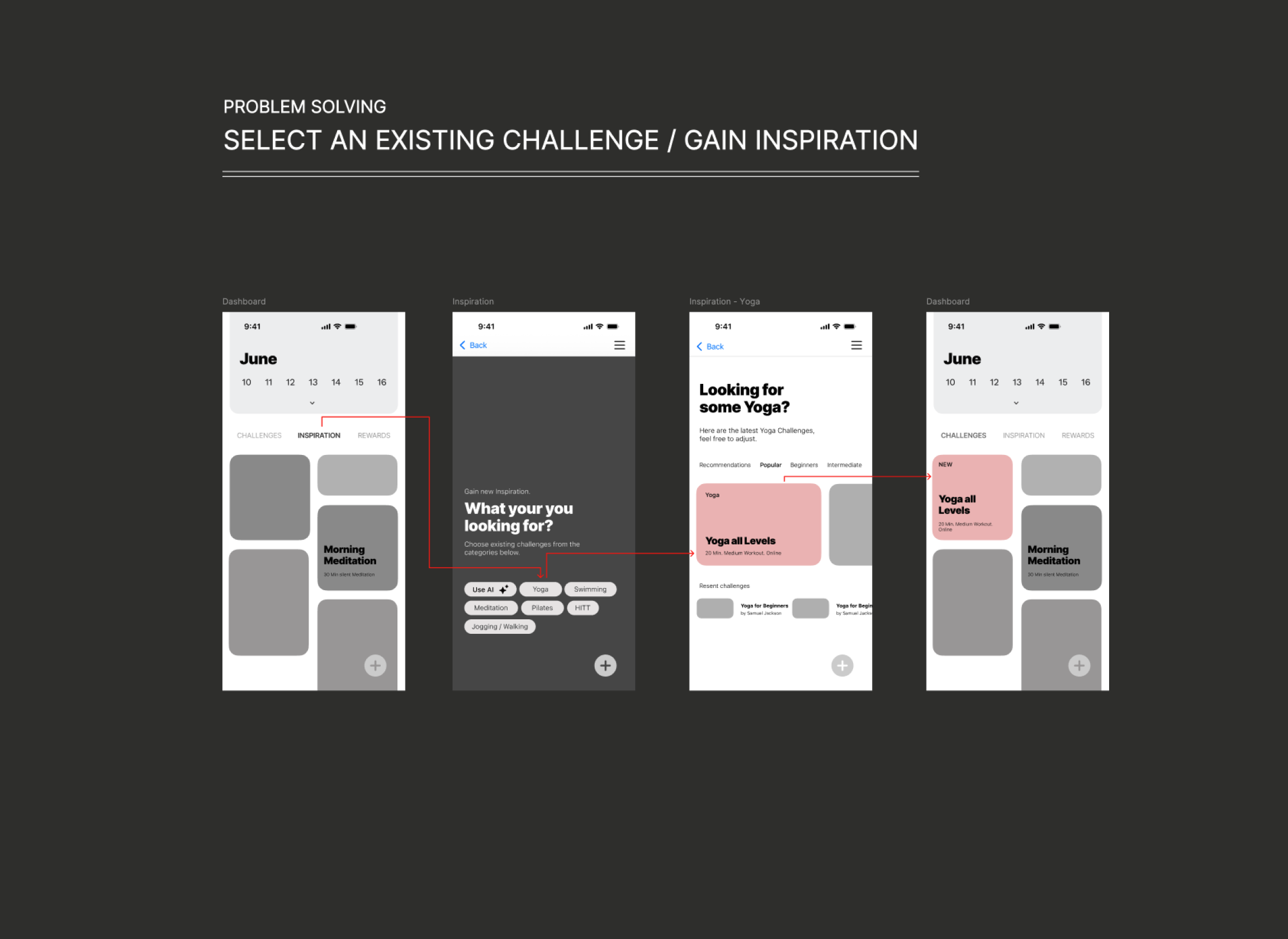
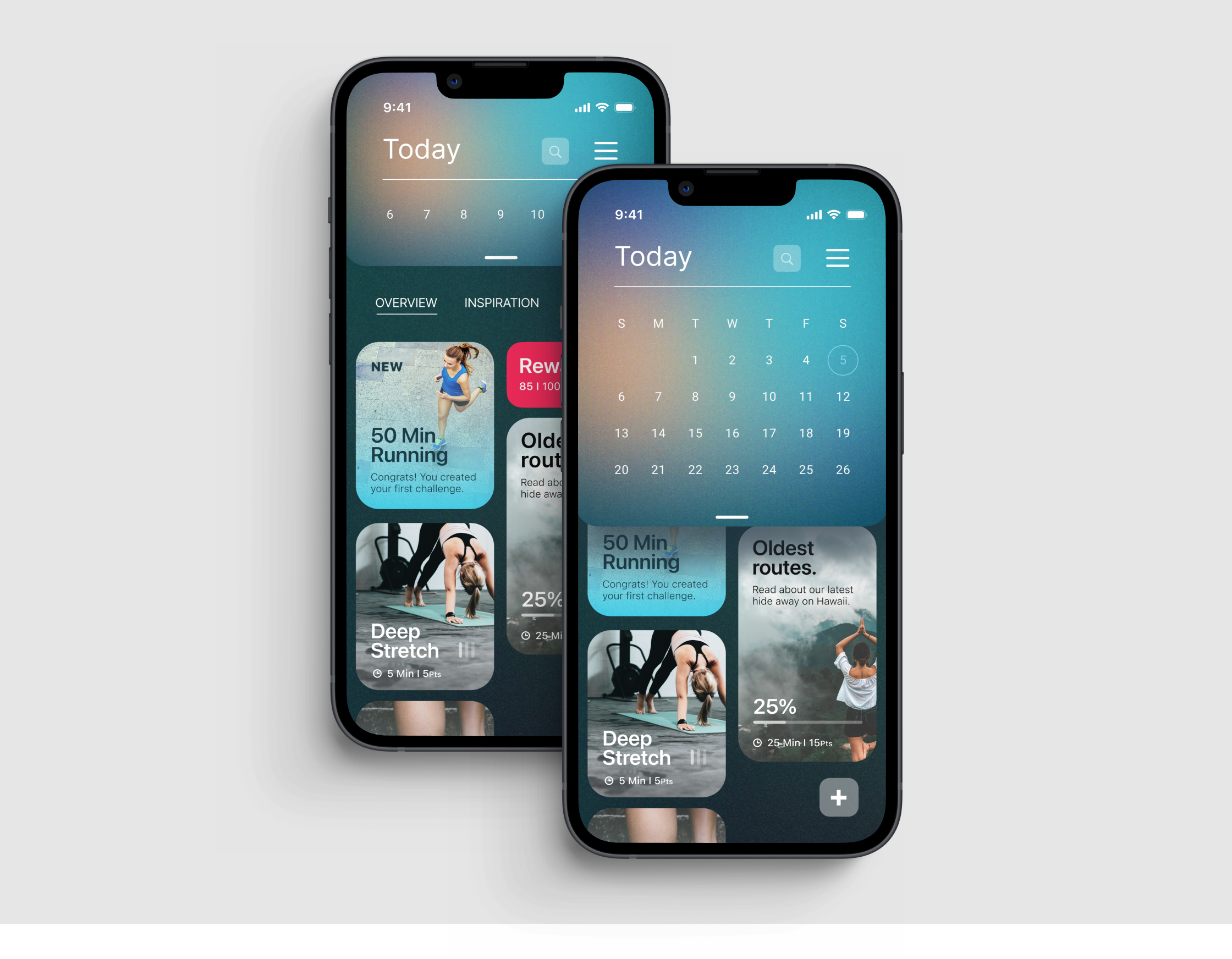
This feedback prompted a significant redesign of the dashboard. In the final round of usability testing, 100% of users found the new flows easy to navigate and intuitive. Additionally, the time spent on tasks was notably reduced, with scheduling appointments becoming 30% faster.

Get access to the whole project on Figma
What I learned

Challenge Assumptions:

Validate that existing solutions are effective through user testing.

Test Early:

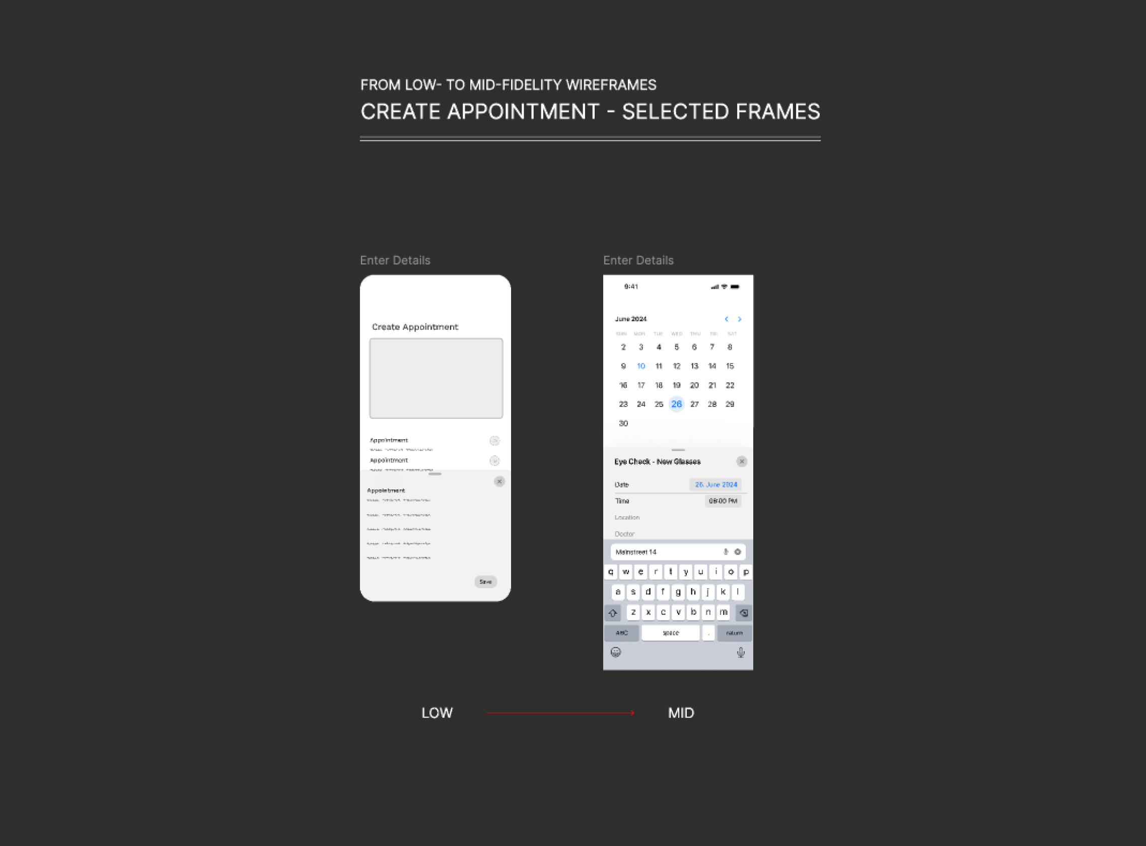
Conduct user tests early, even with mid-fidelity wireframes, for valuable feedback.

Seek Growth:

Continuously pursue practical experiences to enhance UX knowledge.